Way back I figured out a way to create a manual shape map in Power BI by using a hodge podge of tools and formats. It worked but was painful.
Map stuff came up again at work recently, so I got to rethinking this task and found a much more elegant solution using OpenStreetMap to pull the shapes I need directly and then converting them to the EsriJSON format that Power BI’s ArcGIS visualization can read. The notebook shapes_from_openstreetmap.ipynb in this GitHub repo has all the code. This resource Python for Geographic Data Analysis helped me get started.
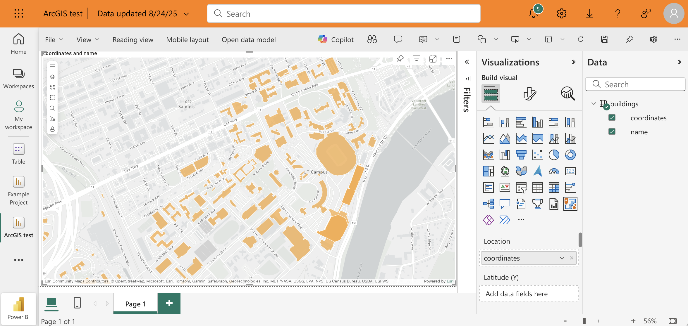
At the top of the notebook you put the name of the place that you want to pull all the buildings for. If you run the notebook interactively, you can check the map that gets generated to make sure it looks right. The notebook then converts the geometry into EsriJSON and exports a csv file with the json strings in a column coordinates. This can then be used in the ArcGIS visualization in Power BI like so:
As is this notebook is quite simple at the moment, but could easily be extended however you want. You can add more places to extend your map, or you could enrich your map by adding more columns to this table or connect this table other tables in your data model. If you notice any issues with the data that you pull from OpenStreetMap, you can also edit the data directly in OpenStreetMap and then re-run the notebook to get the updated shapes.
The last thing I’ll mention is that I wish this was possible to do in the base “Azure map” visual in Power BI. This seems to be the one that Microsoft pushes you to use as they slowly deprecate all their other map visuals, but to date it doesn’t seem possible to draw custom shapes with it. The ArcGIS map looks good, but it’s not the best user experience because it prompts the user to agree to terms and conditions or to log in every time they open the report. Hopefully we’ll be able to accomplish the same thing with Azure Maps soon, and when that day comes I’ll be sure to make yet another post.